Enhancing career connections through user-centered design
Job I/O: Usability Testing for a Seamless Virtual Job Fair


Project
Usability Testing for Job I/O Virtual Job Fair
Timeline
Oct 2020 – Dec 2020
Target User
IT graduates and young professionals seeking job opportunities
Location
Germany
Industry
Career Services / Technology
Overview
This case study explores the usability evaluation of Job I/O, a virtual job fair platform by Get in IT, designed to connect IT graduates and professionals with employers. Conducted during a Human-Computer Interaction course, our project identified usability barriers and provided actionable recommendations to enhance platform navigation, accessibility, and engagement.
Using the Think Aloud method and ISO 9241-11 usability principles, we evaluated core features such as the landing page, dashboard, job wall, profile access, navigation bar, and lobby stream. Our team delivered insights that contributed to real-world improvements.
My Role
UX Researcher, Usability Tester, Interaction Designer (Team 1: Reporter)
Skills
UX Research, Usability Testing, Interaction Design, Qualitative Data Analysis, Design Recommendations
Tools
20%
Increased User Engagement
45%
Enhanced Dashboard usability
35%
Improved navigation efficiency
Problem
Job I/O’s engaging design and interactive features were undermined by usability issues that disrupted the virtual job fair experience. Challenges such as unclear navigation, cluttered interfaces, and inaccessible features led to user frustration and reduced task efficiency.
Goal
The goal was to enhance Job I/O’s usability, accessibility, and engagement for IT job seekers by addressing navigation barriers, clarifying functionality, and improving the overall user experience.
Key Challenges
🗓️ Schedule Page Confusion: Speaker-focused visuals misled users about the page’s purpose.
🧩 Dashboard Overload: Uniform styling created cognitive overload.
🔍 Job Wall Limitations: Lack of filters hindered targeted job searches.
👤 Profile Access Issues: Hidden placement made profile management difficult.
🔠 Navigation Bar Readability: All-caps text reduced legibility.
🔊 Lobby Stream Disruption: Autoplaying audio caused disorientation.
Solution
Usability testing delivered valuable insights that informed targeted design recommendations to improve navigation, accessibility, and user engagement. These improvements helped align the platform with the needs of its users and guided developers in making iterative, user-focused enhancements.
Methodology
Participants: Two female HCI students (ages 25 and 36, from Iran and Taiwan)
Testing Approach: 1.5-hour remote sessions via Zoom on December 4, 2020, using the “Think Aloud” method. Participants shared their screens and verbalized actions.
Tasks: Explore the landing page, bookmark sessions, join live streams, respond to company inquiries, chat with employers, and log in/out.
Data Collection: Sessions were recorded and transcribed using transcription software. Feedback was analyzed using ISO 9241-11 usability principles (e.g., self-descriptiveness, controllability). Miro facilitated collaborative analysis, Google Translate assisted with non-English feedback, and Microsoft Word was used for reporting. Figma supported the creation of mockups.
Clean, organized layout with readable content
Friendly landing page with appealing logo and visuals
Job recommendations on the job wall aided relevant searches
Creative navigation labels (e.g., Lobby, Jobwall)
Interactive Live Chat
Engaging Video Streams
Insightful Employee Perspectives
Empathetic and Supportive Tone
Seamless Social Media Integration
Credibility Through Major Companies
Positive Findings
Positive Findings
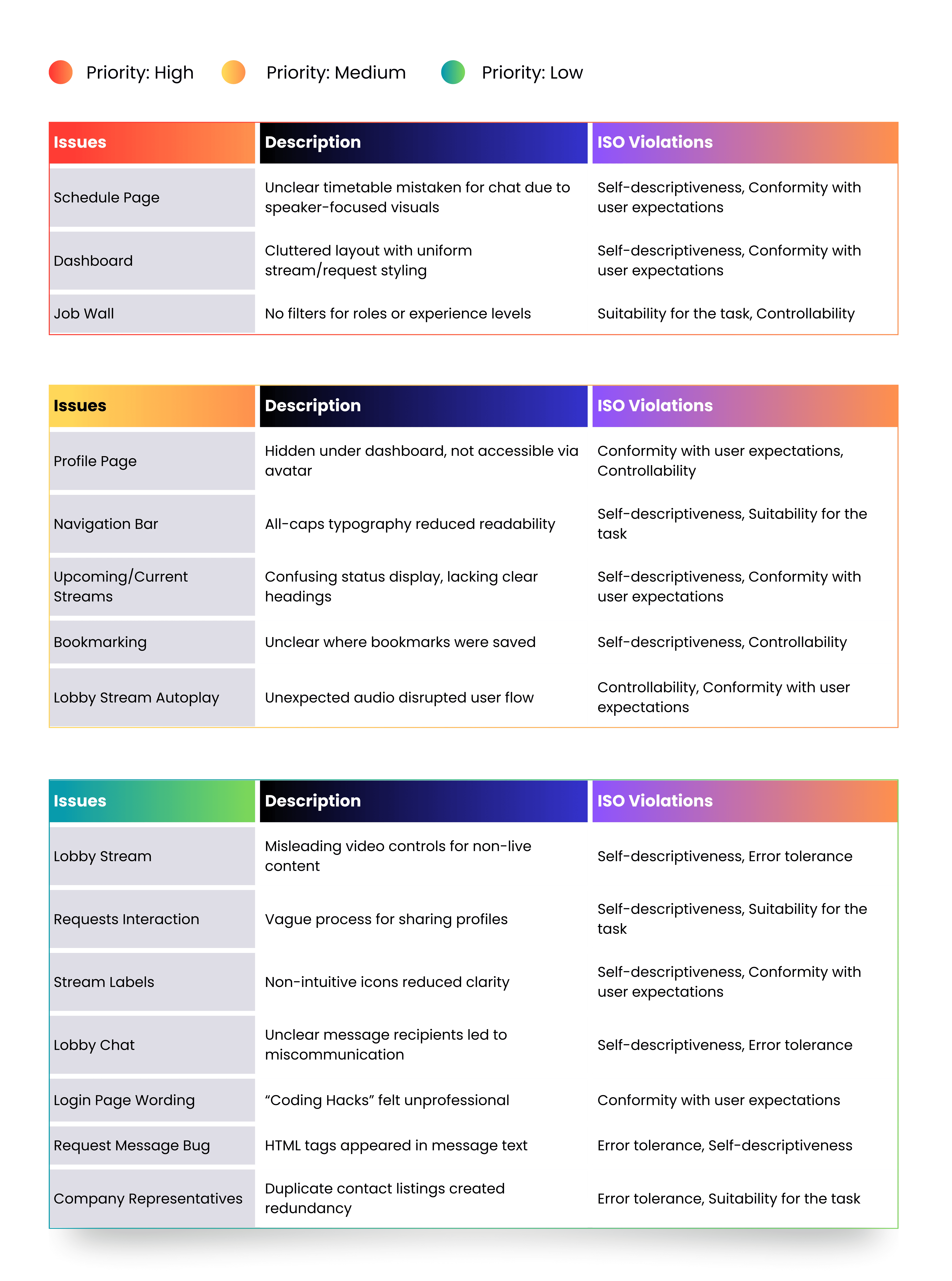
Below is a table of 15 usability issues, categorized by priority and aligned with relevant ISO 9241-11 principles:
Usability Issues
Design Recommendations

Schedule Page
Redesign as a grid timetable with session tracks and topics
Visual indicators for bookmarked sessions
Add tooltips to stream labels for clarity
Dashboard
Add spacing to separate functions
Use distinct colors/styles for streams vs. requests
Move chat box to top; merge requests into chat view
Job Wall, Profile page
Add filters for job roles and experience levels
Include a link to the broader “Get in IT” job search platform
Make profile accessible via avatar dropdown and nav bar
Navigation Bar
Replace all-caps with mixed case for readability
Fix navigation bar position for consistent access
Lobby
Mute video streams by default
Add countdown labels for upcoming streams
Remove inactive video controls
Provide short stream overviews
Increase spacing between tabs
Additional
Clarify when users are leaving the platform
Add a visible search box
Promote résumé check feature more prominently
Refine stream labels, chat interaction, and login language
Resolve bugs (e.g., HTML errors, duplicate listings)
Current/Upcoming Streams
Add headings (e.g., “Now Live”, “Starting Soon”)
Conclusion
The Job I/O usability testing project provided actionable insights that enhanced the virtual job fair platform’s usability, accessibility, and overall experience. Through remote testing, collaborative analysis, and design mockups, we identified and addressed key barriers using ISO 9241-11 principles. Our recommendations supported real-world platform improvements, ultimately benefiting job seekers. This project deepened my expertise in UX research, usability testing, and interaction design—demonstrating the impact of user-centered design in digital career services.