Transforming e-learning into a seamless, interactive experience

Project
Redesigning Moodle
Timeline
June 2023 - Jan 2024
Target User
Students and teachers in e-learning
Location
Germany
Industry
Education
Overview
This case study focuses on the redesign of Moodle, a popular learning management system (LMS) used in academic institutions. The project involved a complete UX overhaul, including user research, wireframing, prototyping, and usability testing. The goal was to enhance Moodle's interface to improve accessibility, navigation, and user engagement. A user-centered design approach was applied, integrating research insights with accessibility and interaction design principles.
Key areas addressed include dashboard structure, course navigation, content layout, communication tools, and mobile responsiveness. The redesign aims to create a more streamlined and intuitive user experience for both students and instructors.
My Role
UX Researcher, UX/UI Designer, Interaction Designer, Usability Tester
Skills
UX Research, Wireframing, UI Design, Prototyping , Usability Testing , Accessibility Design
Tools
35%
Simplified Course Navigation
45%
Enhanced User Engagement
65%
Improved Learning Activities
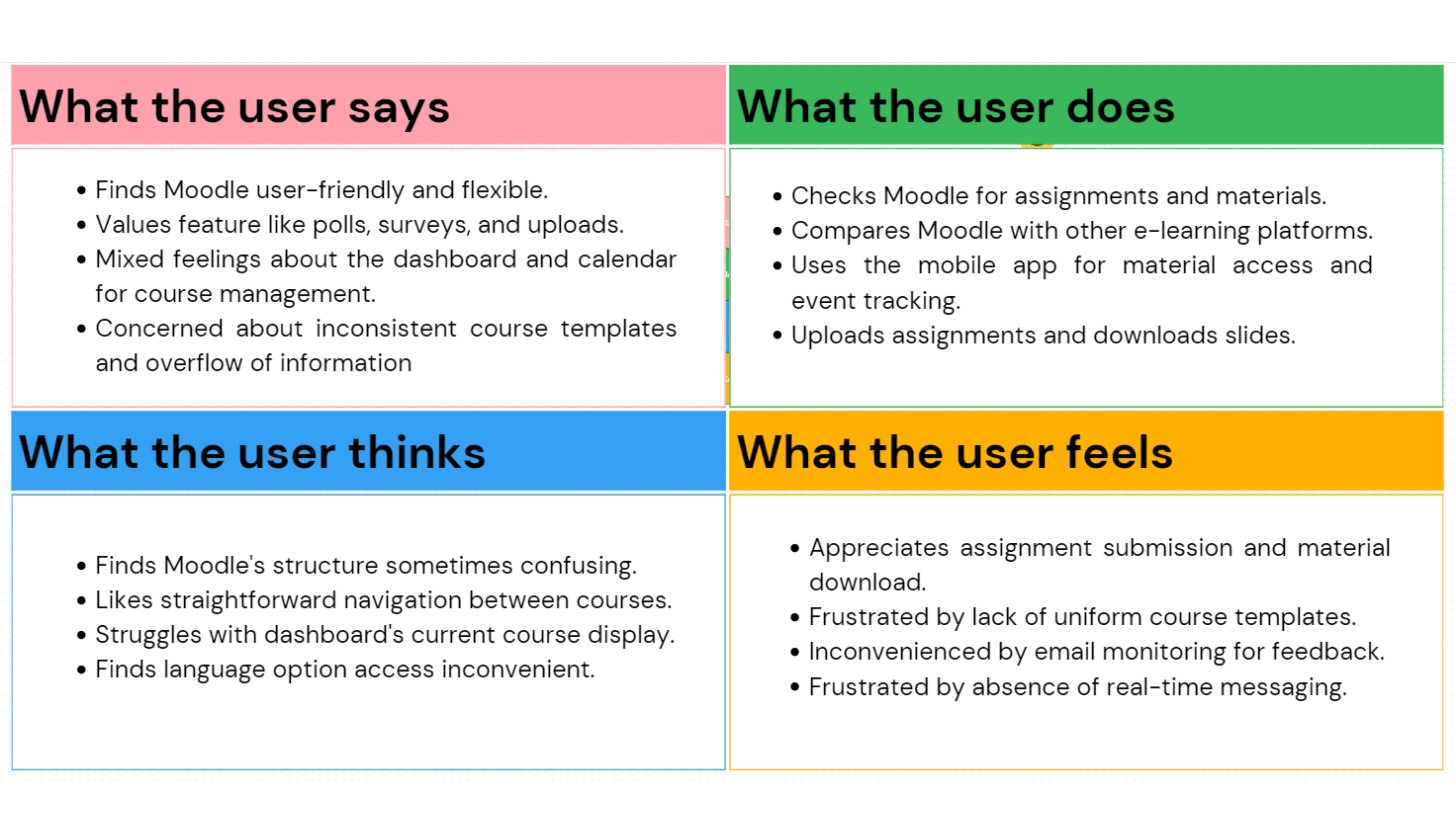
Problem
Moodle's existing interface presented several usability and accessibility issues, especially for users in higher education. Key problems included:
Unstructured and inconsistent course layouts across departments and instructors.
Overloaded dashboards lacking clarity and personalization.
Poor navigation requiring multiple clicks to access key areas.
Absence of modern communication features like real-time chat.
Limited support for non-native speakers due to hidden language settings.
Suboptimal mobile usability, particularly for viewing and submitting assignments.
These issues collectively created confusion, hindered task completion, and negatively impacted user satisfaction and learning engagement.
Goal
The goal of the redesign was to improve Moodle’s usability, accessibility, and engagement for students and instructors in higher education. The objectives included:
Creating a consistent and structured layout across courses.
Simplifying navigation through an intuitive interface.
Improving access to learning materials, assignments, and deadlines.
Introducing real-time communication tools to support collaboration.
Enhancing mobile responsiveness and accessibility across devices.
Supporting international and multilingual users more effectively.
Key Challenges
📌 Inconsistent Course Structure: Variations in course design made it difficult for users to orient themselves quickly across different subjects.
📌 Cognitive Overload: Dense content presentation and lack of visual hierarchy led to frustration, especially on the dashboard and course pages.
📌 Navigation Complexity: Users were often required to return to the homepage to switch between tasks or find information.
📌 Lack of Communication Tools: Existing forum tools were outdated, and users lacked the ability to chat or collaborate in real-time.
📌 Low Accessibility Awareness: Language settings and help content were not easily discoverable, limiting access for non-native speakers and new users.
📌 Mobile Limitations: The interface was not optimized for smaller screens, leading to poor usability on mobile devices.
Solution
The redesign introduced structural, functional, and visual enhancements, grounded in qualitative user feedback and best practices in UX design.
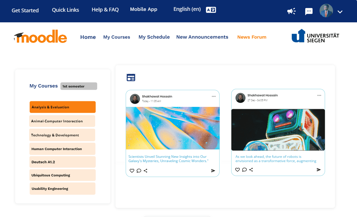
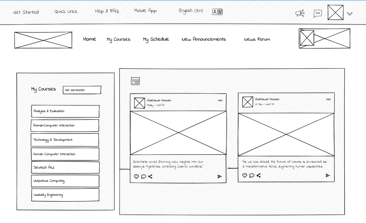
🔁 Interface & Navigation
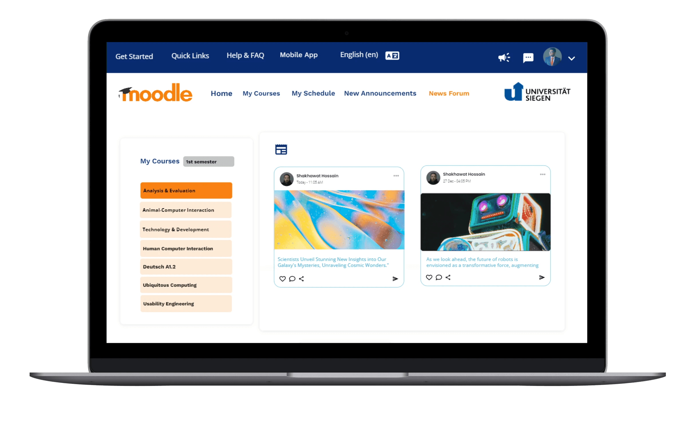
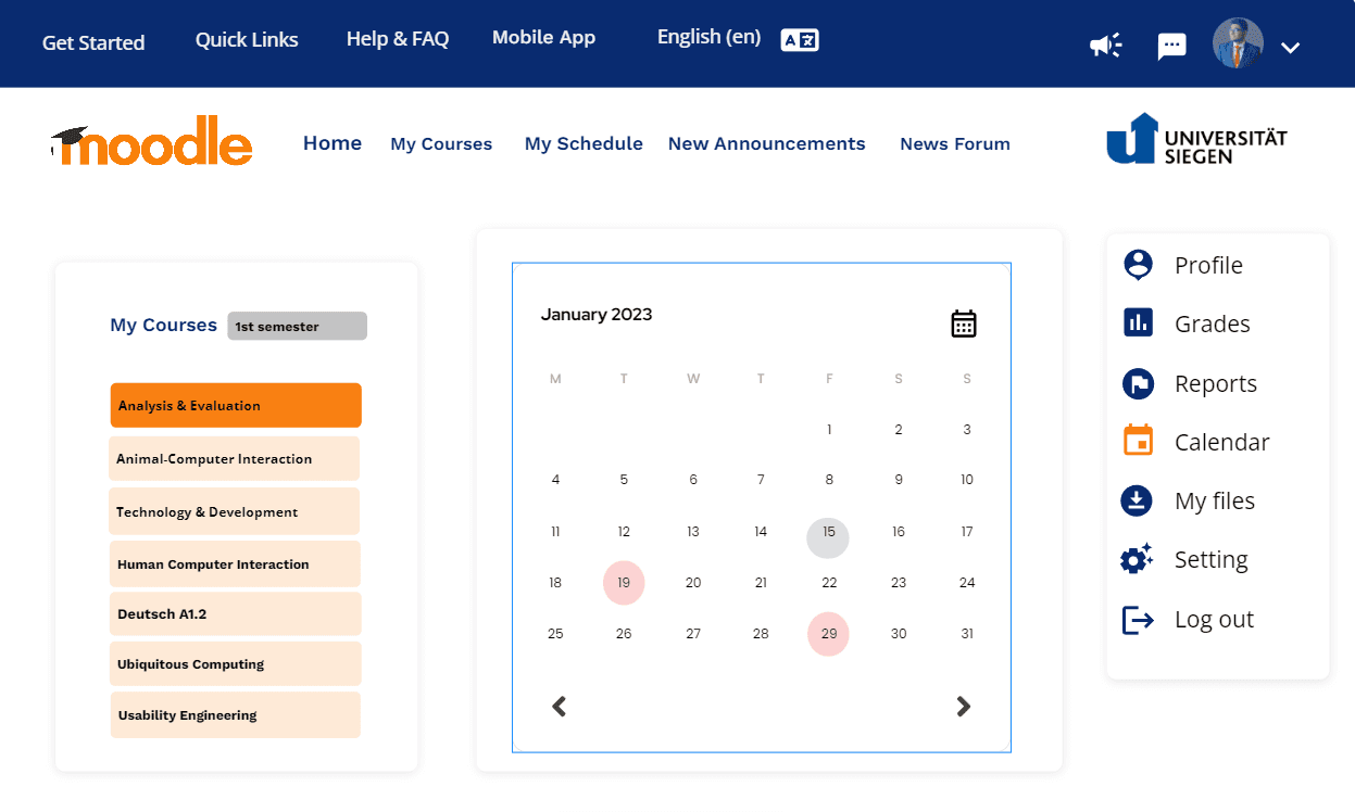
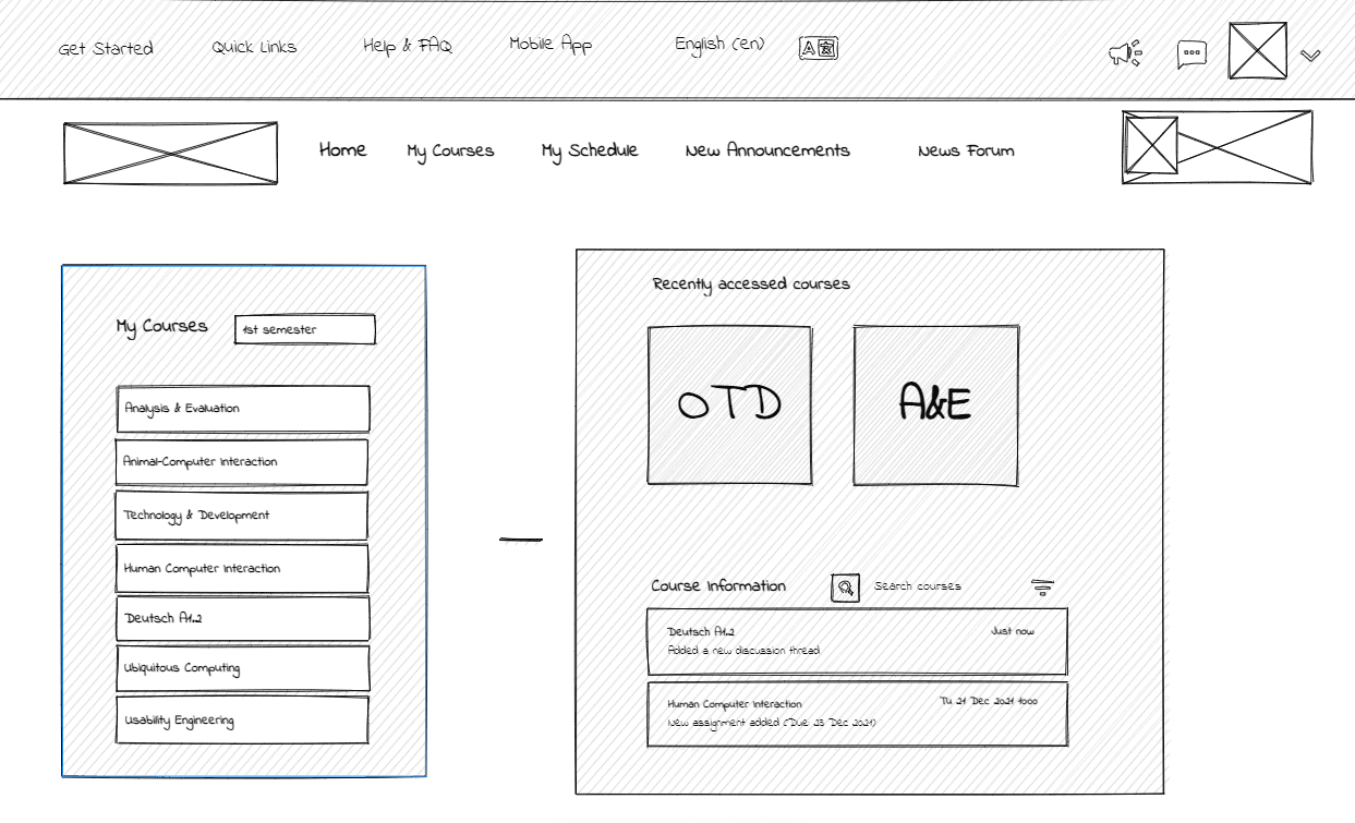
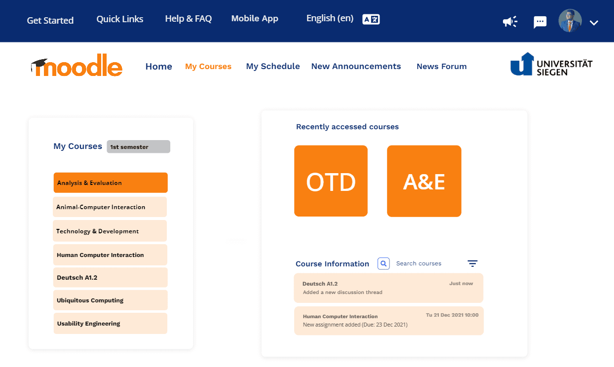
Replaced the vertical sidebar with a horizontal navigation bar for better access to assignments, grades, and messages
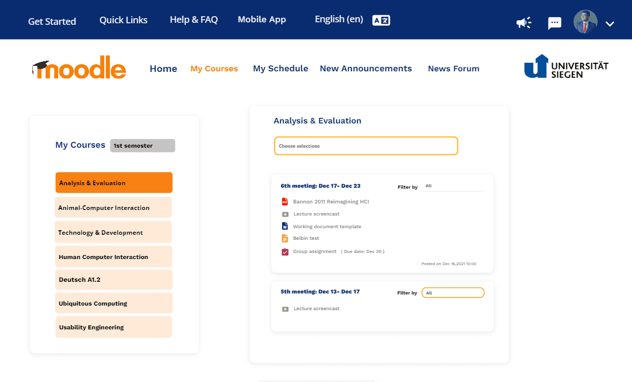
Implemented semester-based course filters and standardized templates for course layout
Introduced collapsible sections in course content to reduce information overload
💬 Communication & Collaboration
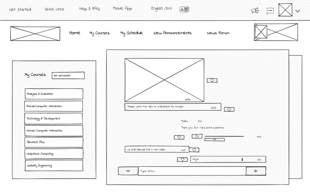
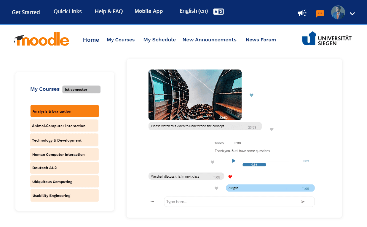
Developed an interactive chat function for real-time communication between students and instructors
Redesigned the news forum into a dynamic feed with reactions, threaded comments, and notification settings
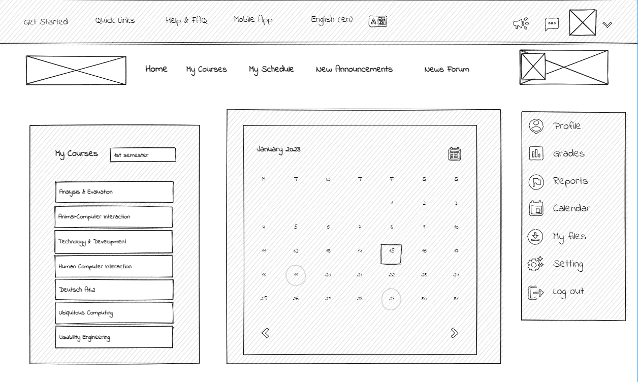
📅 Task Management
Enhanced the dashboard with recent activity, assignment deadlines, and personal notifications
Integrated a calendar view to highlight weekly or semester-wide events and submissions
🌍 Accessibility & Inclusivity
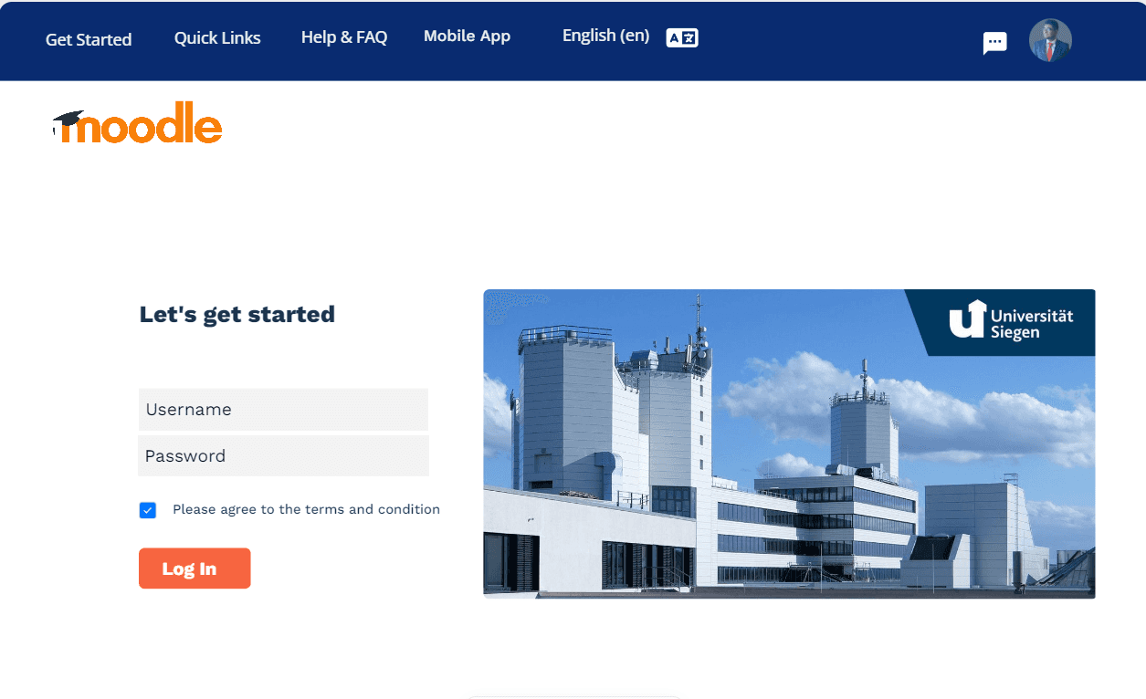
Moved the language toggle to a consistent global navigation area
Created an onboarding help section with video tutorials and an improved FAQ
Applied color psychology and accessible fonts to support readability and focus
Ensured responsive layouts for mobile and tablet screens

Add Sections or Complete Pages
Add breakpoints to your blank page, then drop sections to have them responsive out of the box.
Get Started
Learn More
Design Process
1. Research & Discovery
Conducted contextual inquiries and semi-structured interviews with students and faculty using Design Case Study Framework.
Applied thematic analysis to extract patterns and group user feedback
Created empathy maps and user journey flows to inform design direction
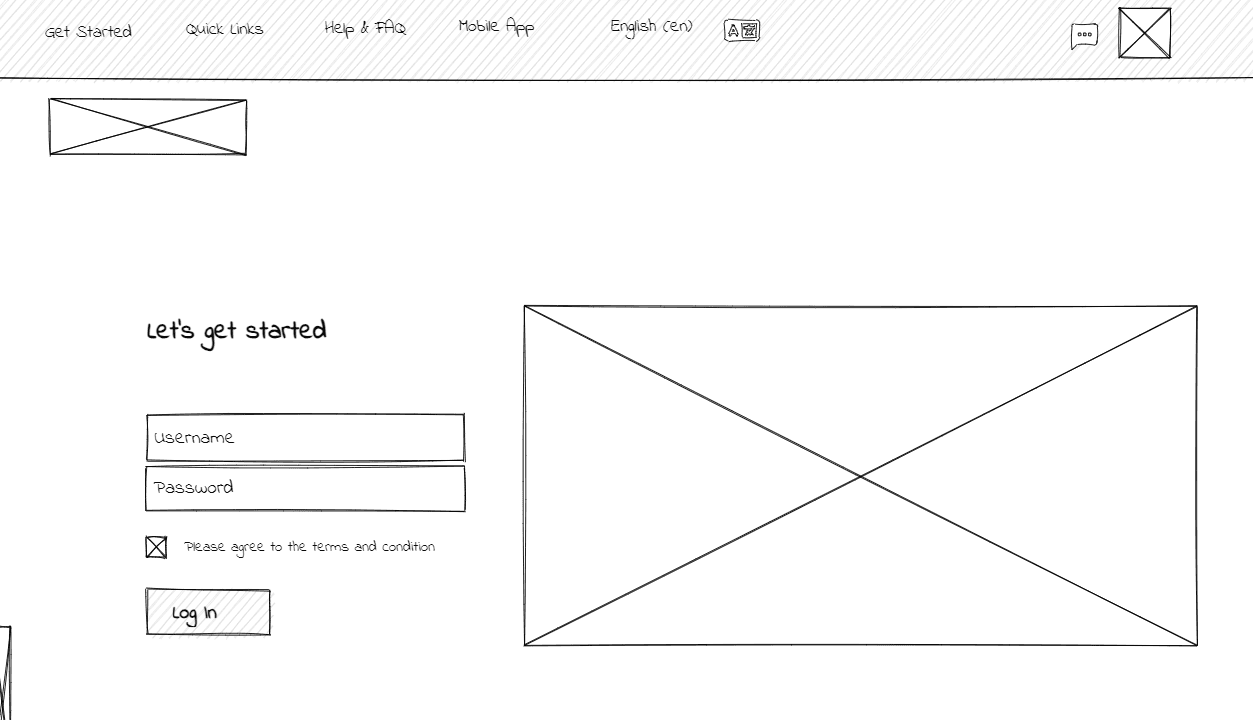
2. Wireframing
Designed low-fidelity wireframes for six core screens:
Login Page
Course Selection Page
Course Overview
Navigation Panel
News Forum
Interactive Chat Feature
3. Prototyping
Developed high-fidelity interactive mockups in Figma
Applied university branding, consistent spacing, and clean typographic systems
Created interactive flows simulating real user scenarios
4. Testing & Evaluation
Conducted cognitive walkthroughs and shared short video-based prototypes
Collected open-ended feedback through surveys
Iterated based on clarity, contrast issues, and user suggestions

User Side Redesign
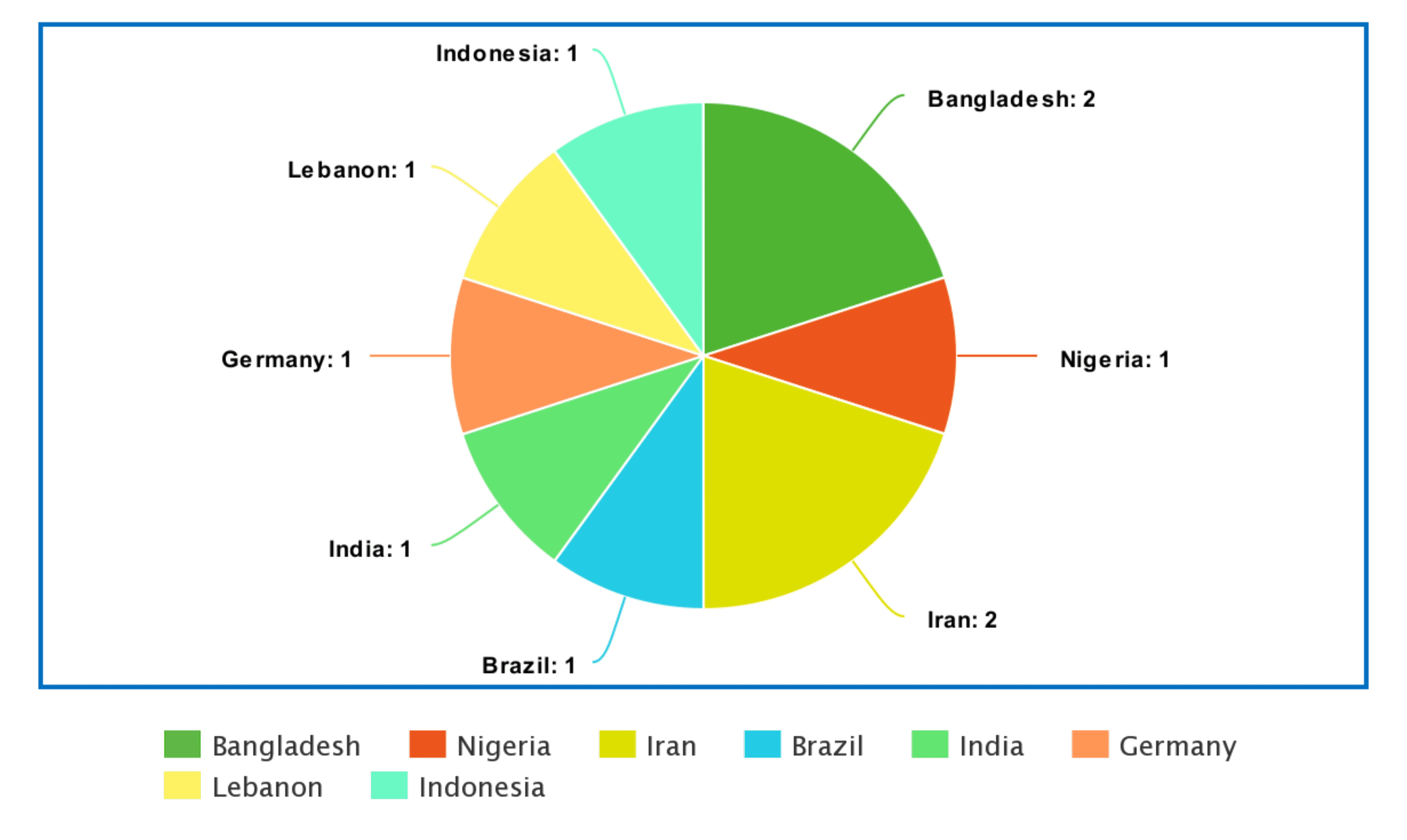
Origin of the interviewees


Conclusion
This redesign demonstrates the impact of a user-centered approach in transforming a complex, legacy system into a streamlined, engaging, and accessible learning platform. The process highlighted the importance of involving real users early, applying accessibility standards, and focusing on structural clarity.
The proposed interface supports faster task completion, better collaboration, and a more inclusive learning experience—ultimately helping institutions deliver better digital education at scale.
Key Features
📚 Structured course organization with semester filtering
📌 Horizontal navigation bar for intuitive interactio
💬 Real-time chat functionality embedded into the platform
📅 Calendar with color-coded assignment and event reminders
🧭 Collapsible course modules with progress indicators
🌍 Language selector accessible from all pages
📱 Fully responsive mobile layouts
🎓 User onboarding via help videos and FAQs
Results & Feedback
User feedback was collected from students and instructors through Microsoft Forms and 1:1 sessions.
90% of participants preferred the redesigned navigation and dashboard layout
80% found the chat and calendar features highly valuable for learning coordination
Users appreciated the course filtering and clarity of the redesigned UI
Non-native users reported easier access through improved language visibility and help tools.