
The Power of Color Psychology in Web Design: Enhancing User Engagement
In today’s fast-paced digital world, web designers are constantly striving to create visually captivating and interactive websites that not only engage users but also drive conversions. One of the most influential elements in the design process is color psychology. This powerful tool can significantly affect user behavior, perception, and engagement, making it an essential consideration for any web design strategy.
In today’s fast-paced digital world, web designers are constantly striving to create visually captivating and interactive websites that not only engage users but also drive conversions. One of the most influential elements in the design process is color psychology. This powerful tool can significantly affect user behavior, perception, and engagement, making it an essential consideration for any web design strategy.
Color psychology is not just about choosing attractive colors for your website; it’s about understanding the emotional responses each color can evoke and how that aligns with your brand’s goals. It’s a subtle but highly effective way to influence the user experience and encourage desired actions, such as clicking a button, signing up for a newsletter, or making a purchase.
Understanding the Basics of Color Psychology
Color psychology is the study of how different colors influence our emotions, perceptions, and actions. Over time, researchers have identified that specific colors can evoke specific feelings or responses from people. Here’s a deeper look at some fundamental colors and the psychological effects they typically have:
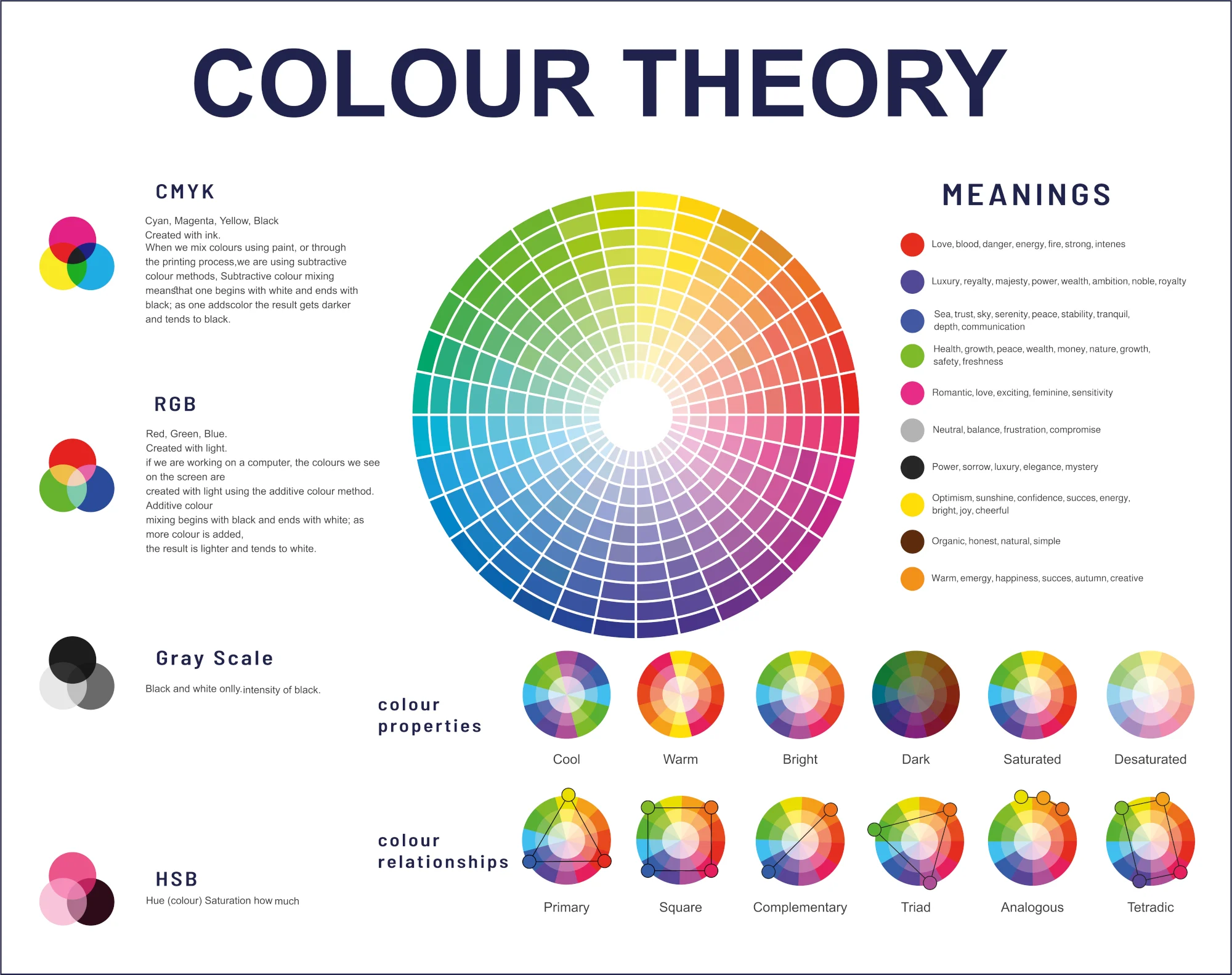
Red: Often associated with passion, excitement, and urgency, red can stimulate emotions and increase heart rate. In design, red is frequently used to capture attention and create a sense of urgency. However, because of its intensity, it should be used sparingly to avoid overwhelming the user. For instance, red might be ideal for call-to-action buttons (like "Buy Now" or "Sign Up") or for highlighting special offers.
Blue: Blue is typically linked to trust, calmness, and professionalism. It’s a color that evokes feelings of stability and dependability. That’s why many corporate websites, especially those in the financial and healthcare industries, incorporate blue as their primary color. It reassures users that the brand is reliable and trustworthy, making them feel more confident in their decisions.
Green: Green is commonly associated with nature, health, growth, and prosperity. It has a calming effect and is often used in websites related to wellness, sustainability, and environmental causes. It also signifies balance and harmony, making it a great choice for health-related websites, eco-friendly brands, or even financial institutions that want to communicate growth and prosperity.
Yellow: Yellow is a color that represents optimism, energy, and creativity. It catches the eye quickly, which is why it’s often used to highlight important information or calls to action. However, overusing yellow can create a sense of anxiety, so it’s best to use it in moderation.
Purple: Purple conveys luxury, creativity, and elegance. It is often used by brands that want to appear sophisticated and high-end. This color is great for premium products, beauty brands, or anything that evokes a sense of prestige.
Black and White: Black and white are timeless and versatile colors. Black is often used to communicate elegance and authority, while white represents purity and simplicity. These two colors together can create a clean, minimalistic design and enhance readability. They are often used as primary colors in luxury products or high-end fashion brands.
Practical Applications in Web Design
Now that we’ve covered the basics, let’s dive into how color psychology can be applied practically in web design. Consider a health and fitness website, for example. The goal of this website is to promote well-being, encourage users to engage in fitness activities, and foster a sense of community around healthy living.
Green and White Combination: The combination of green and white in web design can create a calm, clean, and refreshing atmosphere. Green signifies health, balance, and nature, while white symbolizes cleanliness and simplicity. Together, they evoke a sense of well-being and encourage users to engage with the site. A fitness website might use green to highlight calls to action, such as “Join Our Fitness Program” or “Start Your Healthy Journey,” while using white to provide a clean and welcoming backdrop for content.
Red for Urgency and Action: When it comes to creating a sense of urgency or encouraging quick actions, red is a powerful color. For example, if a fitness website offers a time-limited discount or an exclusive offer, using red for the call-to-action button, like “Claim Your Offer,” can drive conversions. The urgency associated with red can prompt users to act quickly before the offer expires.
Blue for Trust and Professionalism: For a website that focuses on professional services or health consultations, blue might be used in the headers or navigation menus to convey trustworthiness. This reassures users that the website is credible and the services offered are reliable.
Color Combinations for Specific Audiences
It’s important to remember that the emotional impact of colors can vary depending on the target audience and cultural context. For example, colors that symbolize calmness and peace in one culture might represent something entirely different in another. Therefore, understanding your audience is crucial when selecting color schemes for your website.
Young Audience: For websites targeting a younger audience, bright and energetic colors like yellow and orange might work well. These colors evoke creativity, optimism, and enthusiasm, all of which are appealing to younger users.
Corporate Audience: For businesses targeting a corporate audience, blue and grey are safe, professional color choices. These colors convey reliability, competence, and professionalism.
The Future Outlook: Color Psychology in Evolving Web Design
As web design continues to evolve, color psychology will only become more important. With advancements in technology, designers now have more flexibility to experiment with interactive elements, animations, and dynamic color schemes that respond to user behavior.
For example, websites could use color personalization—adapting the color scheme of a website based on a user’s preferences or previous interactions with the site. This level of customization could create a more engaging experience for the user, increasing the likelihood of return visits.
Additionally, dark mode has become a popular trend in recent years. Many websites and apps now offer users the option to toggle between light and dark modes, which can have an impact on how users interact with the content. Dark backgrounds paired with vibrant colors can create a striking contrast, drawing attention to key elements on the page.
Conclusion: The Power of Color in User Engagement
Incorporating color psychology into your web design strategy can have a profound impact on user engagement and satisfaction. By understanding how colors affect emotions and behavior, designers can craft websites that resonate with their target audience on a deeper level.
Remember, colors aren’t just about making your website look good—they’re about creating a connection with your audience. When used effectively, colors can drive conversions, build trust, and create memorable experiences that keep users coming back for more.